Echoes of a Voice: Artwork

This year, our Advent series at Park Church is called Echoes of a Voice. If you’ve seen the photography in the building, on the livestream, on Instagram, or in your Advent Guide, you’ve probably asked yourself, “what is this about?” or “what’s the connection?”

First, we want to introduce you to John Forney. John and his family have been at Park Church for several years. He’s a self-taught black and white film photographer, working with vintage 8×10 cameras in large and medium formats. For Christ in the Psalms 2020, John shared an incredible photograph in support of our Psalm 104 week. After digging deeper into his work, we reached out about John’s What Remains? series as an artistic vision for Echoes of a Voice.

First, John is going to tell the story of What Remains? Next, we’ll share about its connection to Advent this year at Park Church.

What Remains?

by John Forney

I began this project about 17 years ago as a novice photographer without any real experience. I was looking for an approach to combine my outdoor interests and my photography interests in a way that wouldn’t necessarily create more “landscape photography.” I was mostly aware of what I didn’t want (traditional landscapes), but I thought maybe ghost towns could provide an opportunity to explore and work out some sort of photographic vision.
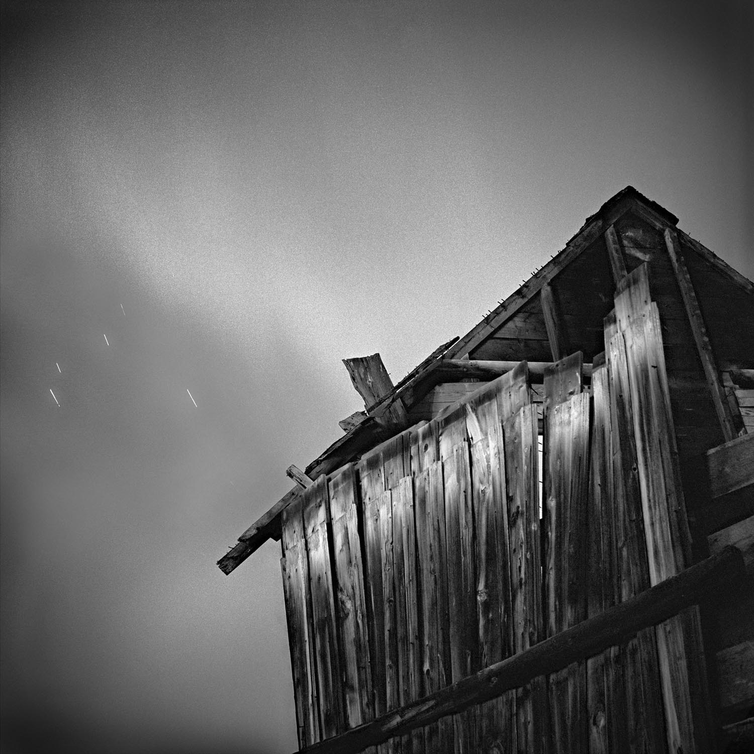
At first, I started to explore ghost towns along the front range. They were nearby, accessible, and allowed me to get my bearings. What may not be as obvious from the early images in the series is that I was shooting at night. It was the only free time I had. I could ballpark my exposure times and let the camera record light for quite some time. Minutes turned to hours. Long exposures uniquely record time and space in ways we don’t experience. I was hooked.

I slowly started to amass a small body of work. The collection of images started to seem cohesive―my loose definition of a project. At this point it was simply personal amusement, but not for long.

I had two experiences that were pivotal in shaping my understanding of the project:

The first experience was on wintery January day. I had obtained permission to enter the abandoned Paris Mill near Alma. What little research I had on the mill indicated it had an unusually large amount of original mining machinery―and, that it was literally infested with rats. I signed a waiver with the real estate company representing the mill releasing them from any personal liability on my part and on a snowy, January day I entered the mill.
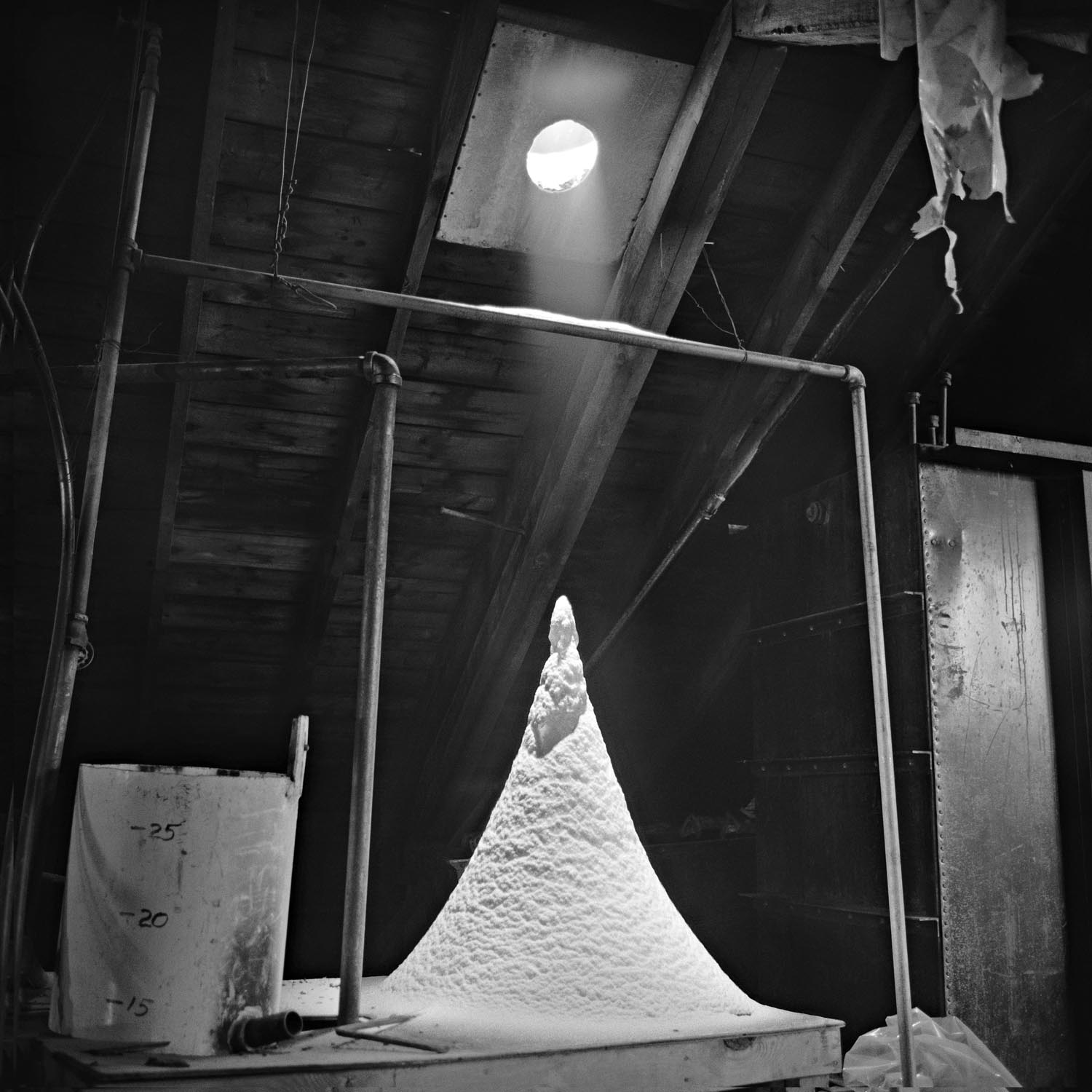
Now, my wife can tell you how unnerved I am just about mice. Frankly, they freak me out. Yet I had willingly stepped into a rat-infested mill. As a matter of personal safety, I’d never say I felt at ease, but as minutes became hours I slowly worked my way through the mill making images. Certain areas of the mill were very dark as the roof and walls were still intact. Other areas where the roof had collapsed became large labyrinths of light reflecting off structures, machinery and the snowfall. In one sense, I didn’t want to leave. In another sense, I couldn’t wait to be done.

This first experience at Paris Mill set the metaphorical backdrop for the next chapter in my life.

The second experience occurred in a much less “assuming” manner. It was a Saturday morning. I was at home. I was washing dishes. My three then-young kids were doing who knows what—washing the dishes was a momentary solitude from the busyness of parenting. My mind was wandering, thinking about my ghost town project. Like a lightning bolt, an epiphany, maybe even a warning: I had the most vivid impression. All I heard or saw in my mind was “THIS IS YOU! You are the ghost town.”

I was taken aback. Like what? But very quickly I kind-of understood. Despite how it sounds on paper, I didn’t perceive this as condemning. It was something deeper that was very personal to me after experiencing ghost towns. I was, unknowingly, on the verge of a very dark season in my life. This time, instead of willingly walking into the “mill,” I would be thrown in. The horrors would exceed my deepest fears. In many ways, this message was one of encouragement that I would inevitably need: “Above all else, guard your heart, for it is the wellspring of life.”

It was soon after this second experience that I named this project What Remains? The title has some obvious tie-ins with the subject matter. But the deeper meaning begs the question: “How’s your heart?”
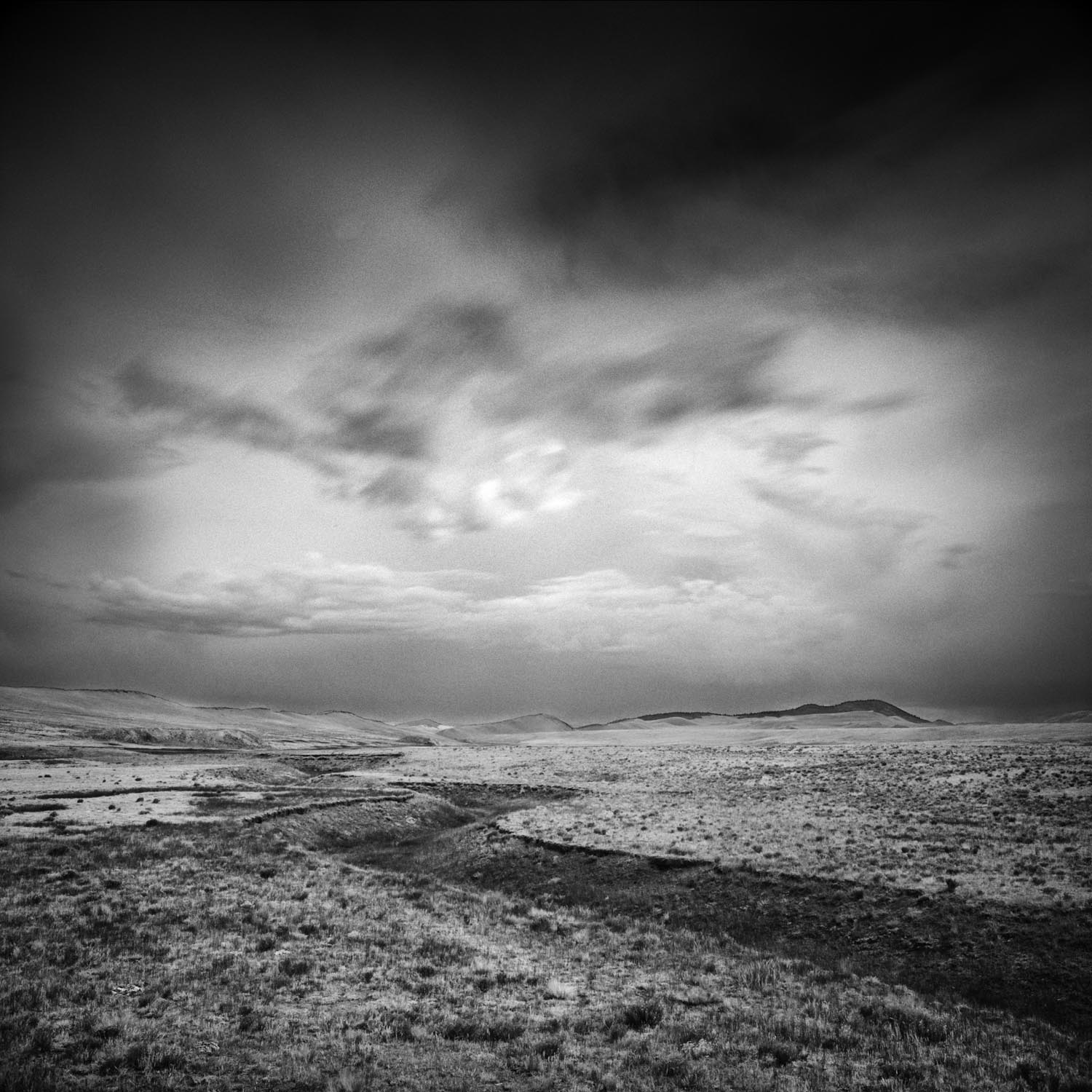
As I look back on this project, I have realized how fear provides an invitation and an opportunity. As I fearfully stepped into the Paris Mill years ago, I realized how addressing fear provides both and invitation and an opportunity to grow. Looking back, my fears were clear and present. But the opportunity provided me with a huge resilience to do the work that I felt convicted to do and produced some of my favorite images to date.

“For now we see in a mirror, dimly…” At that time, I could not know the circumstances and fears that would ensue in the years to follow. These are fears that only with God-given faith, can I walk into and through. I am still in this dark “mill” ―but not alone.

“but then face to face.” I believe He will one day, face to face, reveal the beauty only He can create through His redemption in ways I could otherwise never have known so personally.

See the complete series here. To see more of John’s work, visit johnforney.com


Advent is a season of twofold longing. First, we remember the longing of the world for the first coming of Jesus, the long-foretold Messiah who brought an easy yoke of gracious salvation and love to a weary world. Second, we look at our own world and long for its renewal at Jesus’ second coming. Things are not right here, but we can hear the Redeemer’s voice echoing everywhere. In particular, we can hear His voice in our core longings as a culture and as individuals—we long for justice, we hunger for relationships, we quest for spirituality, and we delight in beauty. None of these longings are fulfilled outside of Christ.

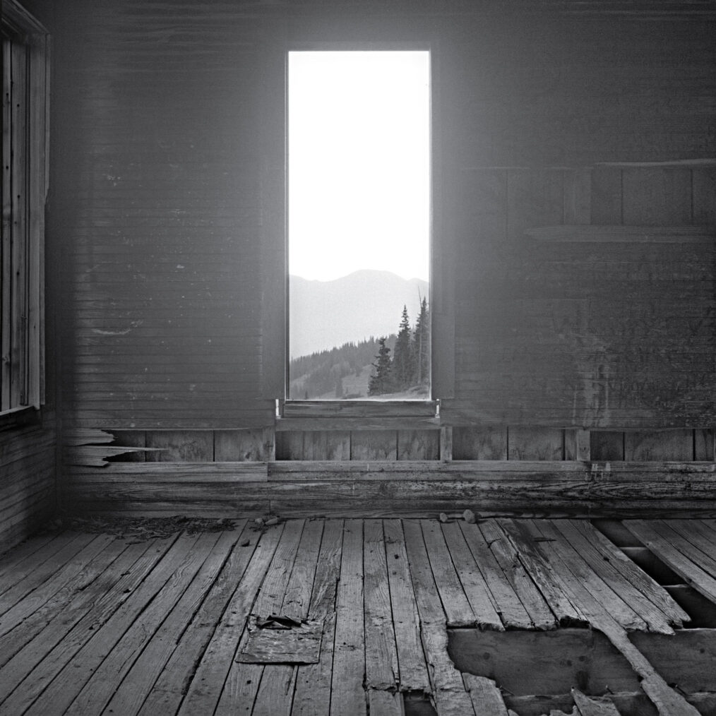
In John Forney’s What Remains? series, we see things and places and moments of transcendent beauty, all framed by brokenness and abandonment. These images speak both to haunting and to unspeakable beauty.

As John explained above, we now see “in a mirror, dimly.” We hear His voice glance off the mighty rocks and whisper across the confusing, empty expanses. In our brokenness, in our longing, and in our best efforts, we know all the better of the great glory beyond us. The Lord Jesus is the fulfillment of these longings, the antidote to our belligerent works-righteousness, and the kingdom of light and wholeness that we dream of on the tired earth.

As the weeks of Advent Progress, we’ll explain each individual piece here on our blog, sharing the images on Instagram. Here are direct links to the week’s we’ve covered so far:

Week One: Justice and the Cave Trail
Week Two: Relationships and the Old Tram
Week Three: Spirituality and the Mine Wall
Advent 2019 Artwork

The season of Advent begins on Sunday, December 1, running through Christmas Eve. Our artwork for Advent this year is by Jeremy Grant—keep reading to learn about the artist, the artwork, and its meaning.

Person

Jeremy Grant is an emerging artist and award-winning graphic designer. He was born in California in 1985. He studied Graphic Design and Illustration at John Brown University. Grant has exhibited his collage and assemblage work regularly across Colorado since 2008. An active member of local arts communities, Jeremy has been invited to participate in numerous group shows, donated art to charity, and been awarded a PPAC micro-grant. His work explores themes of destruction and creation, death and resurrection, and chaos and familiarity. Jeremy Grant currently lives and works in Denver, Colorado.

Piece

Isaiah 40Mark 1
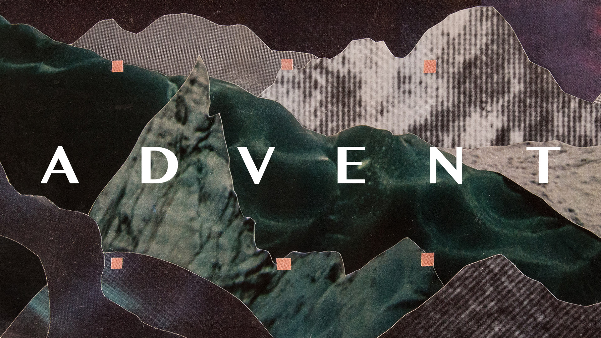
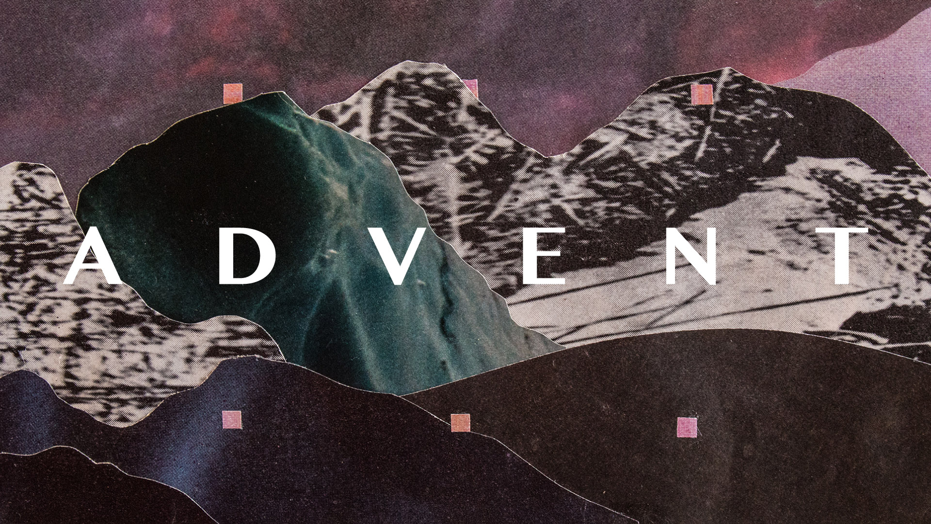
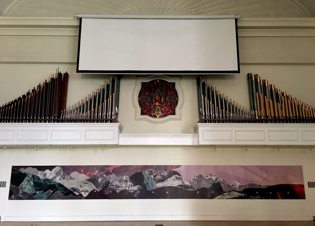
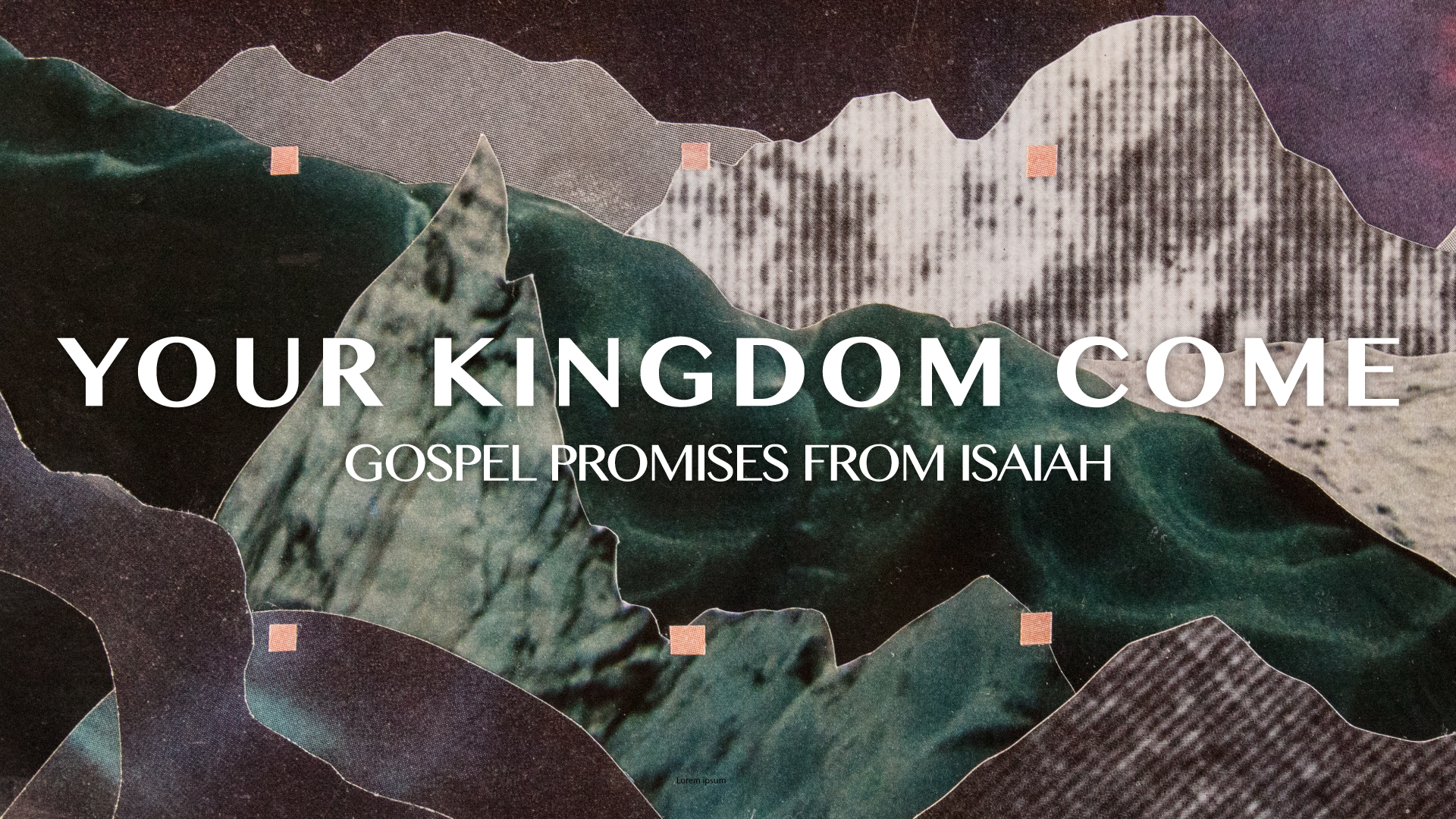
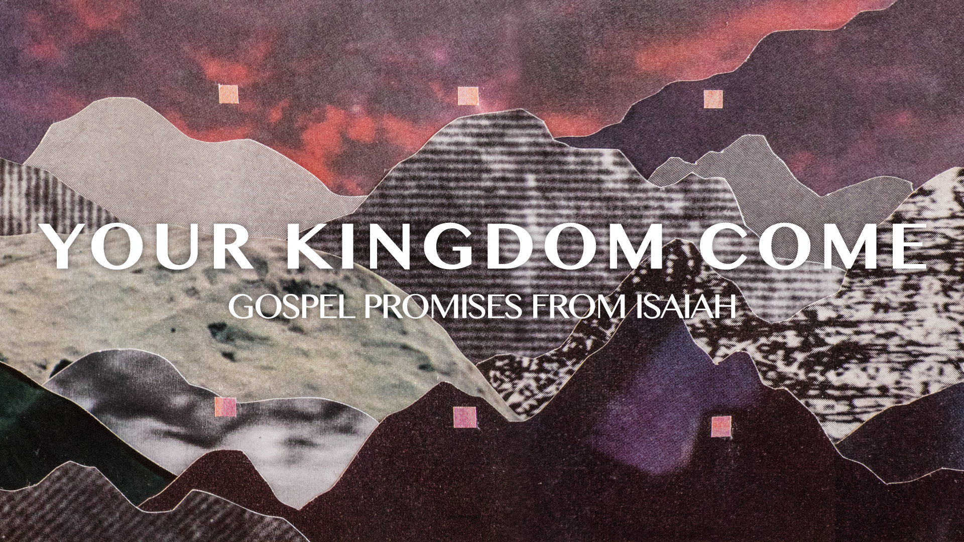
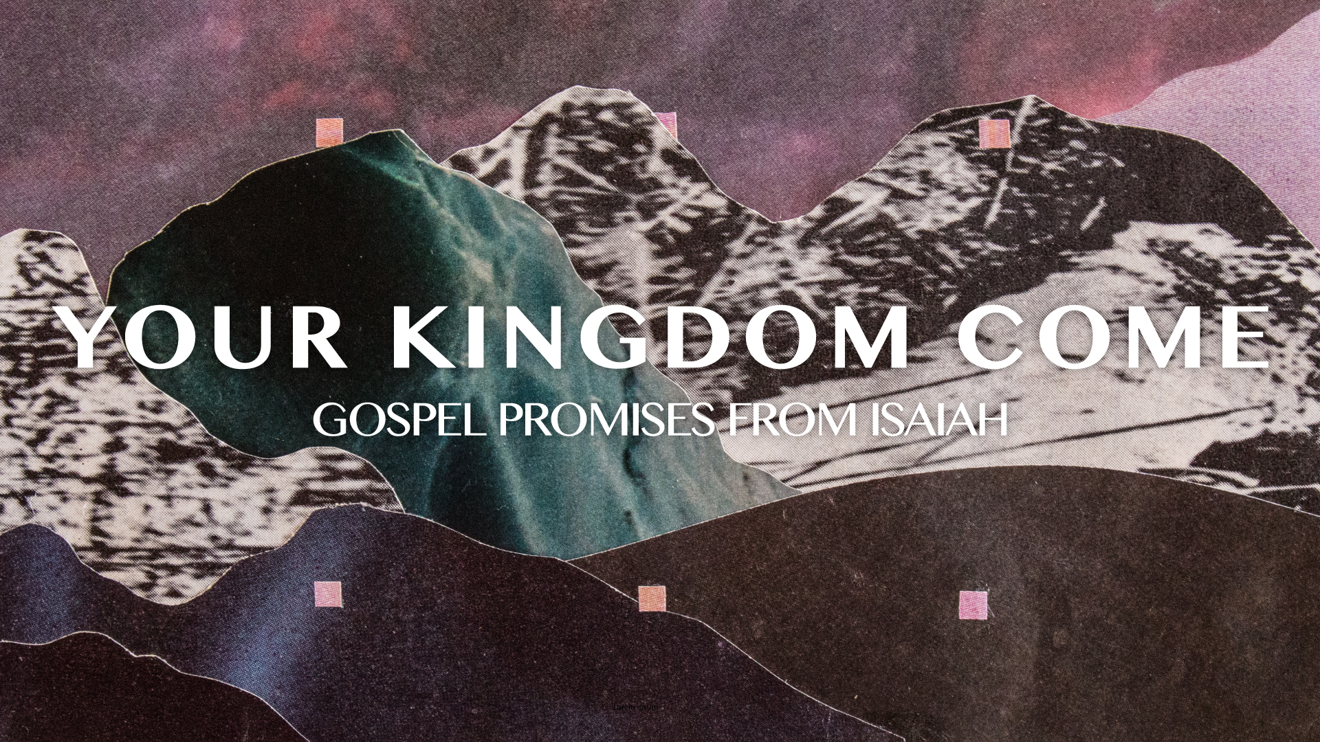
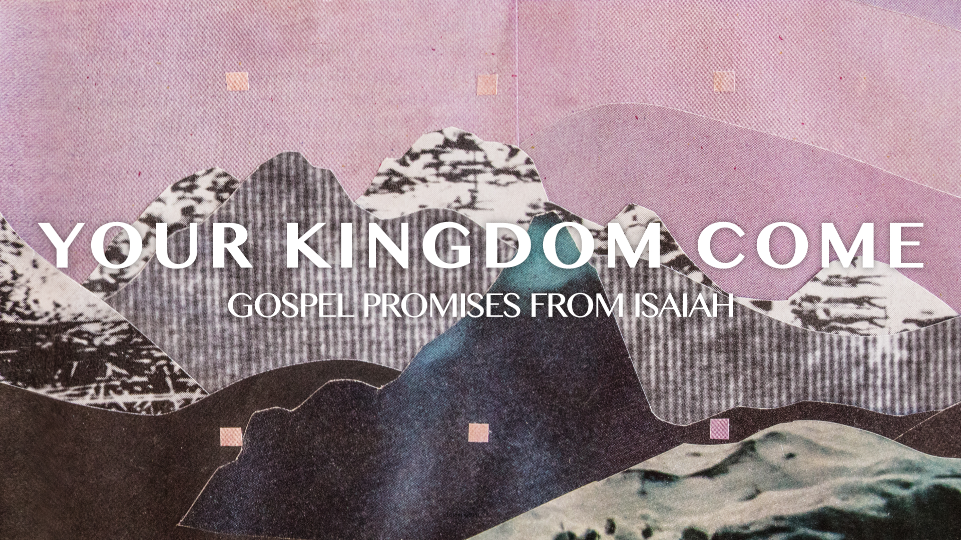
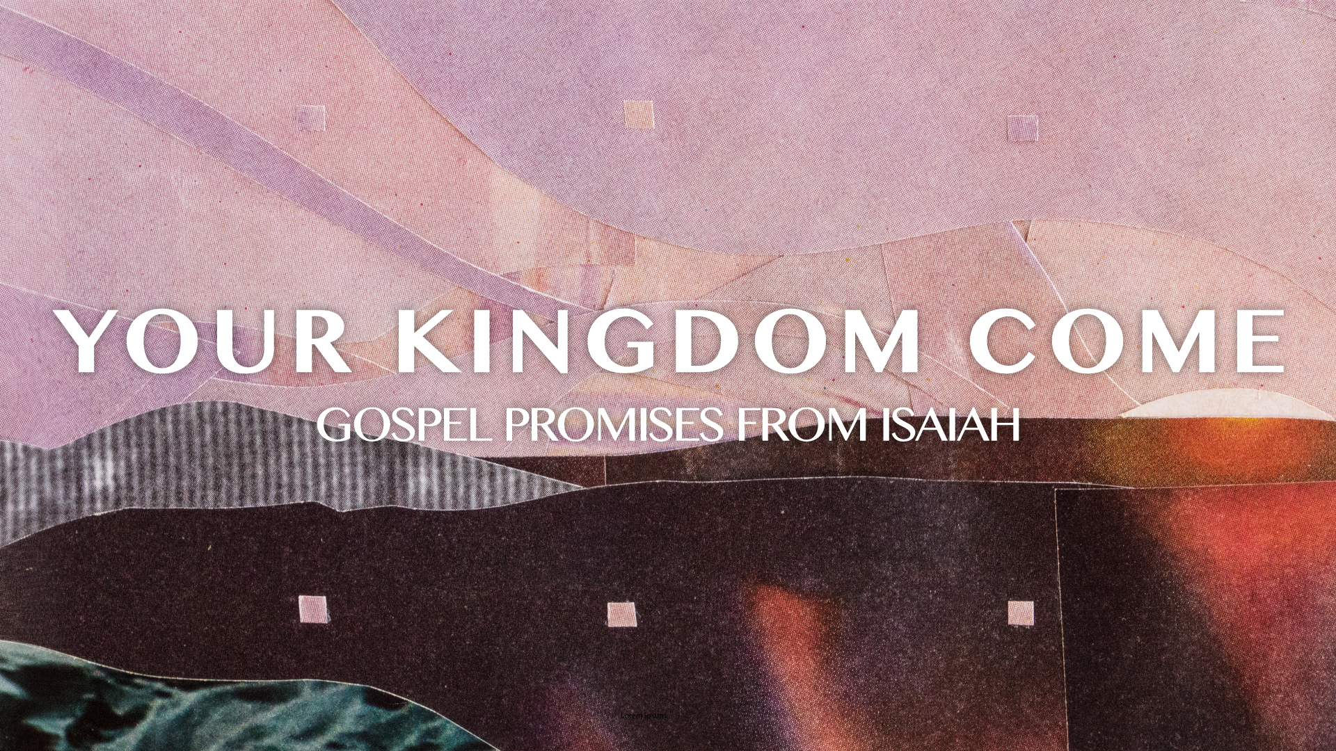
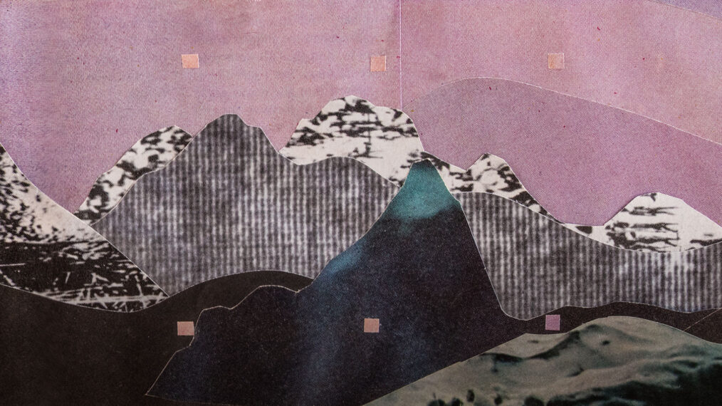
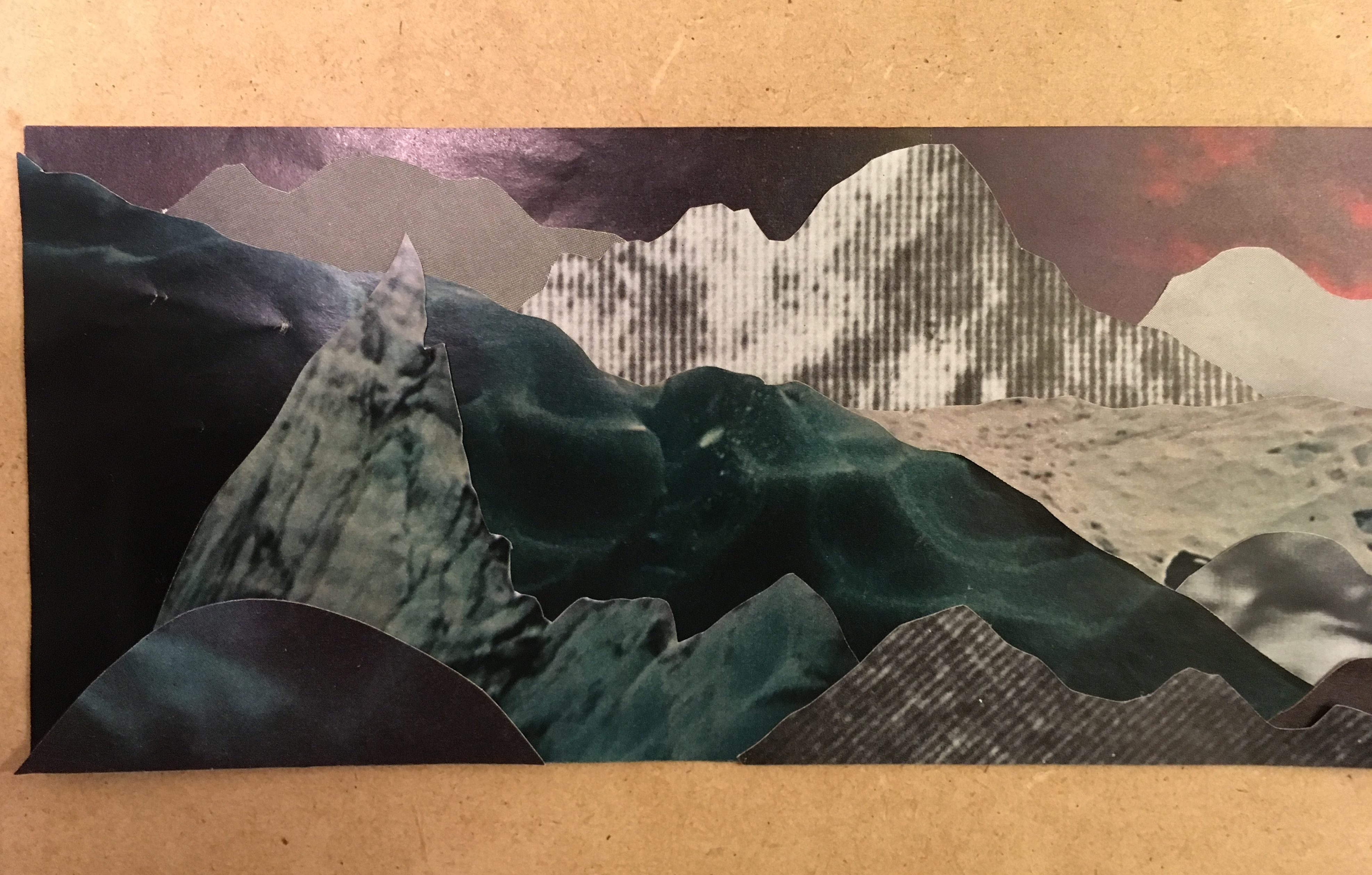
Often during Advent, I contemplate the calling of John the Baptist—“to prepare the way of the LORD,” and to “make straight in the desert a highway for our God.” This calling feels just as relevant for us as it was for him. The people of God had been waiting for Messiah, their Savior King, for hundreds of years. Generations upon generations had lived and died and not seen the promise fulfilled. John’s prophetic calling took him on a difficult path through the desert to preach a baptism of repentance for the forgiveness of sins. John was asked to clear the path for the coming Messiah, Jesus. The scriptures that refer to this calling paint a picture where “every valley shall be lifted up, and every mountain and hill be made low.” The subject of the piece is a landscape that visualizes the work of John the Baptist—the transition from rough, mountainous terrain to open plains is making smooth the way of the LORD. The mountains are cut from pieces that I felt had a sense of static and a feeling of brokenness. We still live in a broken reality. Some brokenness is obvious and agonizing, and other times brokenness is characterized by the monotony of existence—the lack of joy, color, and celebration. The extra-long proportion of the piece is meant to convey the passage of time, a sense of waiting and of a long journey still ahead. The dark to light transition hints at the coming sunrise, our current reality is dim, but the bright light of the coming messiah is a dawn on the horizon. Click on an image below to enlarge.
The complete, final piece:
The sequential pieces, with Advent titles:

Process

Hand-cut paper collage inspired by the themes of the season of Advent. At first, I sought to express brokenness through fragmented pieces—tiny windows into pain. Ultimately, this felt a little one-dimensional and I left it in favor of the landscape idea which had a more rich meaning (see final artwork above). In another early concept, I envisioned cracks and a shattered pattern getting less and less cracked -the color getting brighter and brighter as the collage progressed. U;timately, I felt like it was—again—less robust of an idea, and cracks don’t really “heal themselves.” It’s difficult to express that idea, even though I liked the graphic potential of it. Lastly, an image of the final collage in-process, before I added the pink squares. The squares sort of came to symbolize markers in the passage of time, little ebeneezers if you will.
Easter & Good Friday Artwork 2019

Person

Our artwork for Easter and Good Friday this year was done by Bruce Butler of Art /Rhetor. In addition to being a graphic designer and artist, Bruce co-leads a Gospel Community and often plays electric guitar at Park Church (and all around Denver). Most recently, Bruce has also joined the team at Sweet Bloom Coffee as a barista.

Piece

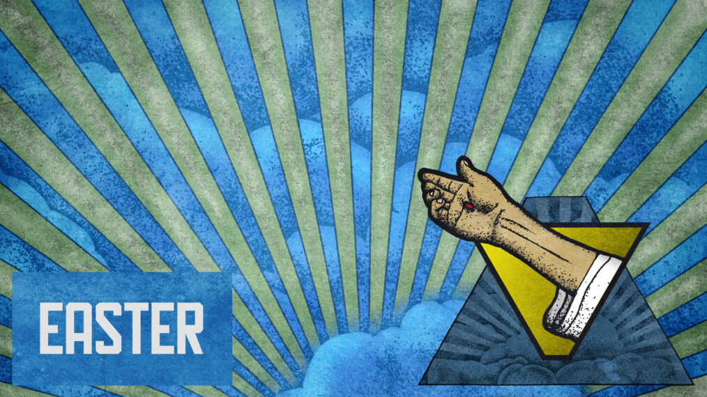
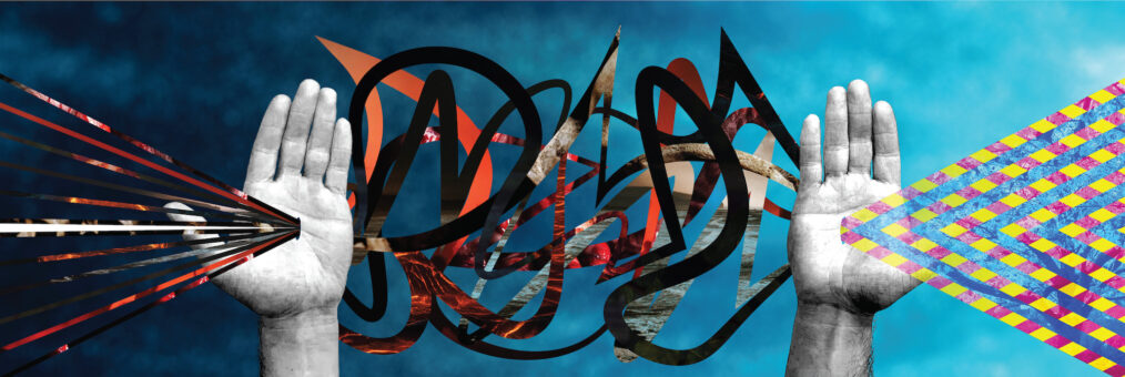
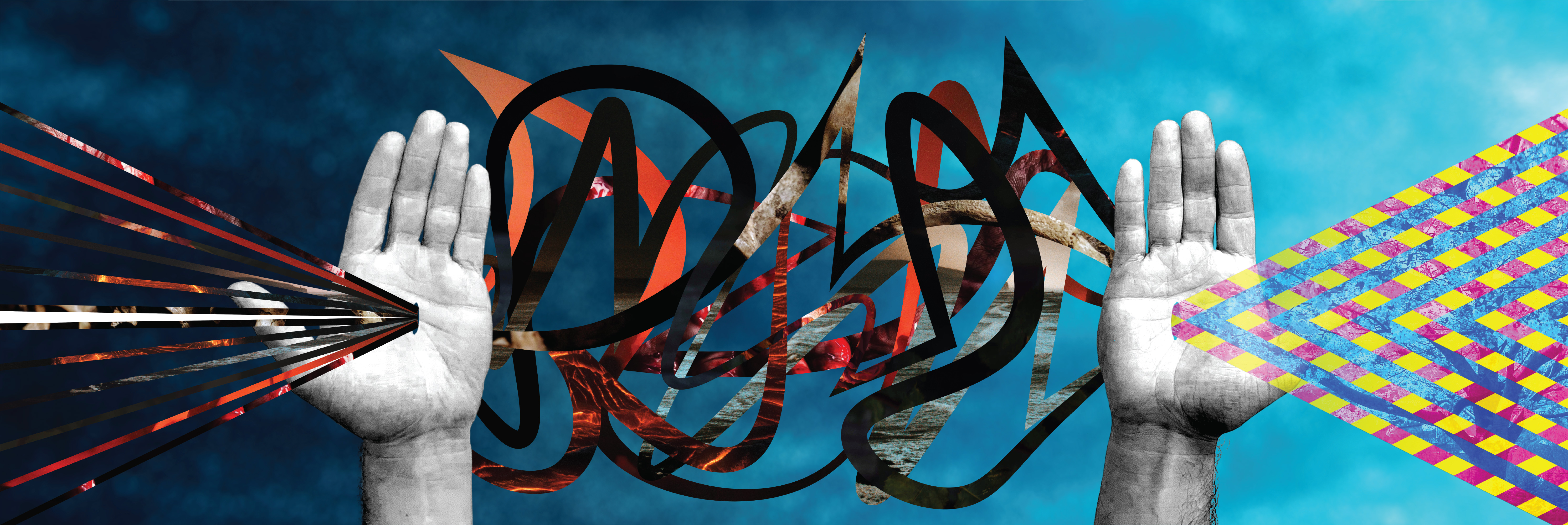
This piece aims to represent all that we celebrate on Easter. The white line coming in from the left represents Jesus entering into the sinful world in purity, as joined by the darker lines made from images signifying death. The left hand illustrates His work on Good Friday: the climax where all the consequences of our rebellion from God met in Jesus, were taken on by Him, and He died under the wrath of God and at the hands of sinful men.

Between the two hands, the darkness and hopelessness of the 3 days Jesus lay in the tomb is illustrated. For his followers, and I imagine for Satan himself, this time must have been a space where sin and death seemed like it had won. Though Jesus had foreshadowed His resurrection (John 2:19, etc.), the visceral reaction of seeing a close friend and leader you believed to be God incarnate viciously beaten and slain must have put the disciples in a state of deep pain and shock.

However, as we know, Jesus rose from the grave on the third day, claiming victory over sin and death. Sin and death’s reign over humanity came to a conclusion at the work of Jesus’ still-pierced hands (John 20:27). Now the life of Jesus, experienced by those who physically met him hundreds of years ago, is a light still continuously shown and refracted, able to be experienced by all who put their faith in Him through the Holy Spirit. This is illustrated by the right hand, where on the other side of Jesus’ death was a radiant joyous life that flows forever.

Click the image below to enlarge.

Exodus Artwork

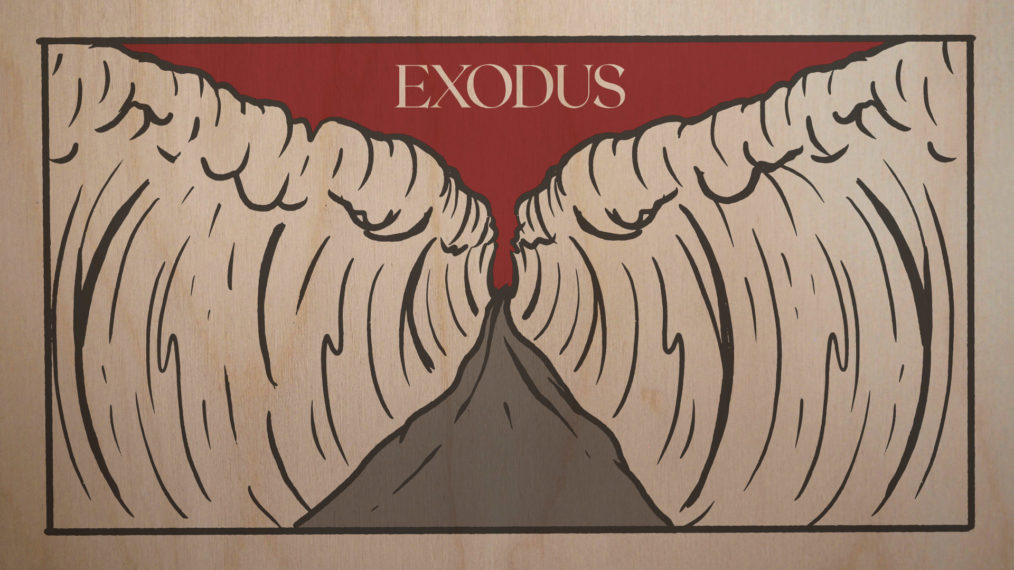
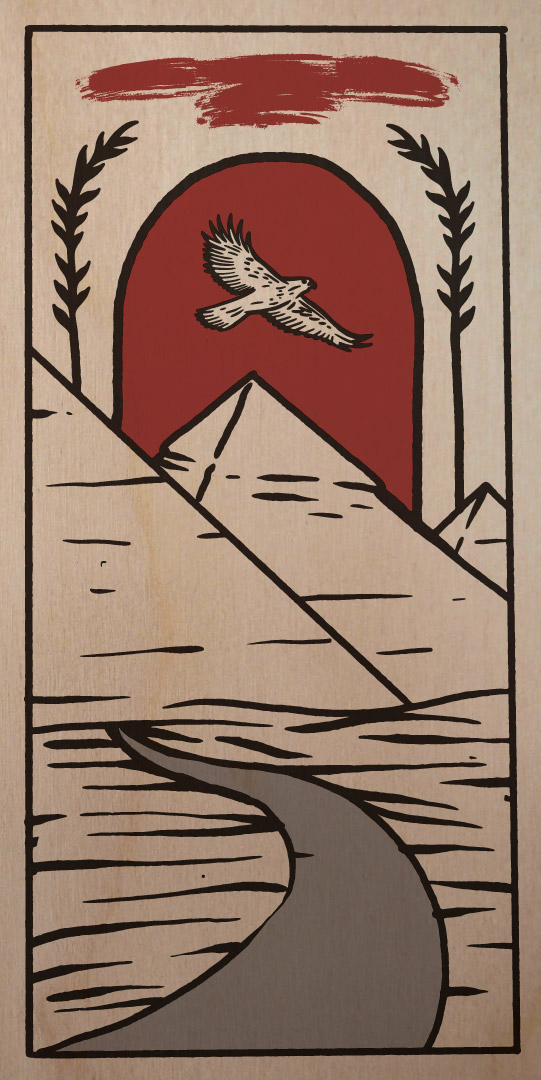
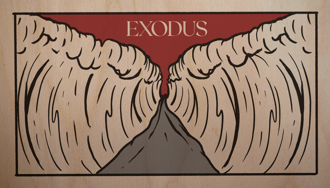
The artwork for our Exodus series was illustrated by hand by Christian Robinson of Oklahoma City. If that name sounds familiar, or if the style of the artwork looks familiar, it’s because Christian was our artist for Genesis as well. As such, the artwork for Exodus serves as fitting follow-up to Genesis. The book of Exodus, in short, is about God’s mission to redeem a people for His kingdom in this world. Christian’s artwork, in three pieces, illustrates the narrative of the book:
Part One depicts Egypt and the way out of it. Egypt’s God-rejecting kingdom is symbolized by their man-made glory-mountains (the pyramids) and false gods (represented by the hawk, symbolic for Ra). The stalks of straw speak to Israel’s oppression and the cruelty of their overlords (ch. 5), while the path and the blood over the doorway describe the ultimate trajectory of the story as seen in the Passover and the people’s flight out of Egypt.

Part Three depicts Mount Sinai and Moses. Images on this piece show a direct contrast to the images on the Part One panel—instead of man-made mountains and false gods, Mount Sinai (an actual God-made mountain) looms in unapproachable glory and gloom and fire and smoke and the presence of the only true God. Moses in the foreground represents both God’s leadership and His giving of the Law, His means for His redeemed children to be holy.

Part Two, the central piece, shows the path through the Red Sea: a sort of climax to the story, God’s final crushing of Pharaoh, and the gateway between the first and second half of the narrative.

As in Genesis, the three pieces are printed on large birch wood panels. Parts one and three hang on the sides of the stage, while part two hangs in the gallery and is shown on-screen in the sanctuary.

Teach Us to Pray Artwork

Person

Our artwork for Teach Us to Pray was done by Bruce Butler of Art /Rhetor. In addition to being a graphic designer and artist, Bruce co-leads a Gospel Community and often plays electric guitar at Park Church (and all around Denver).

Piece

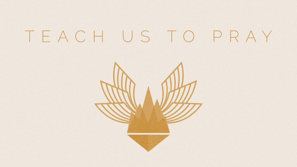
The image includes three rhetorical elements:

First and most prominently, the six wings represent the six appeals in the Lord’s prayer—three “Your” appeals (“hallowed be Your name, Your kingdom come, Your will be done on earth as it is in heaven”) and three “us” appeals (“give us today our daily bread, and forgive us our debts…, and lead us not into temptation”). Additionally, the four living creatures from Revelation 4 in the throne room of God are described as having six wings and always being in the presence of God, speaking the holiness of His name! As a result of our union with Christ, our prayer is always before our Father in heaven, to whom we are instructed to pray “hallowed be Your name.”

Second, the mountains in the center of the image suggest the loftiness this simple prayer and also remind us of the Sermon of the Mount, from whence we get the Lord’s Prayer.

Lastly, and most subtly, the upside-down triangle speaks to the subversive kingdom of Jesus, wherein the first are last, the greatest is as the slave of all, and the people seek first the kingdom of God, simply asking for their daily bread in return.

Ephesians Artwork

Person: Benjamin Rogers

We commissioned Benjamin Rogers to create an original art piece for our series in Ephesians. Benjamin is a full-time instructor of art at Red Rocks Community College. He has an MFA in painting from Arizona State University and his work has been exhibited across the country. He based his work for this piece on several arguments from the text. Here’s how he describes it…

Piece & Process

In creating this piece, I tried to visually connect some of the themes present in Ephesians. Many of these themes are somewhat unrelated in subject matter, so I had to develop a way to allude to them in a tangential manner. This essay isn’t intended to explain 100% of the meaning within this piece, but simply to give you some insight into my thought process.

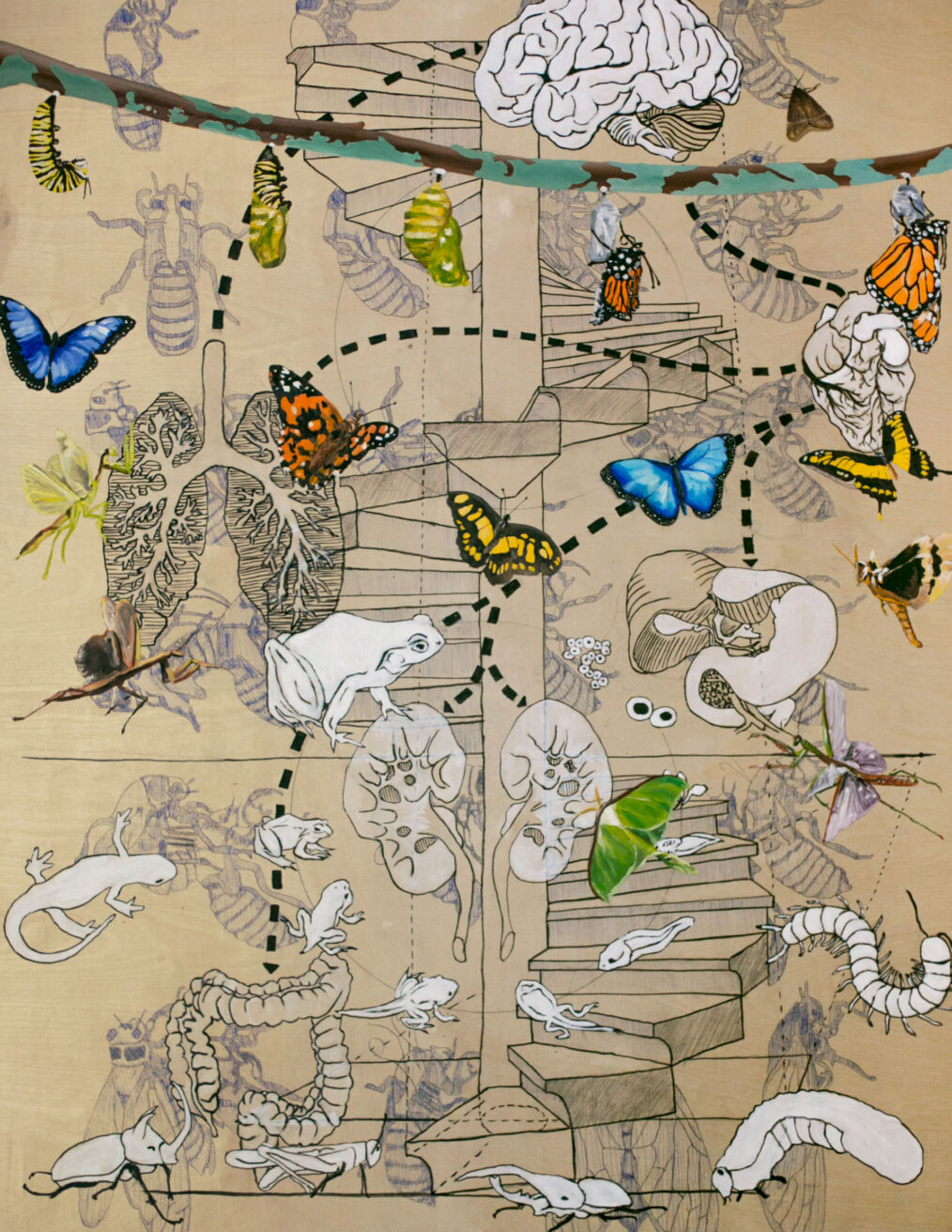
Ephesians 2:19–21 talks about people in the church as “…no longer being aliens and strangers but members of the household of God”. This led me to use vastly different imagery within the same piece in a way that felt cohesive. The resultant image is almost collage-like, but the overall feeling, if nothing else, emphasizes the colorful top layer over top of the monochromatic(ish) layers underneath. This visually communicates a theme of blossoming, new life, as if waking from a dream.

The bottom visual layer is a pattern made from the life cycle of the cicada. I used the cicada’s life cycle because they remain under the ground for 17 years as nymphs, then emerge and molt their shell and live in the light of day for a couple of weeks and die. This process of climbing out of the ground and living in the light reminded me of Ephesians 4:22–24. This was the inspiration for painting moths and butterflies, as well as the life cycles of a frog and monarch butterfly. The bottom and top layers act as conceptual bookends illustrating the same concept. However, one is generally thought of as beautiful while the other is generally thought of as gross. I really like this dichotomy and think that it is pretty illustrative of human institutions.

Ephesians 4:1–16 immediately alludes to a physical body, which only functions properly when all organs work together in unity. This illustration of the workings of the church body is a beautiful analogy, because it demonstrates that there is a lot of unappealing, unappreciated work that is necessary for the Church to flourish. My goal was to illustrate anatomical renderings of some essential human organs, some whose function is obvious and well known and others which aren’t as recognizable or well-understood. I used the implied line to demonstrate the working relationship between them.

Perhaps the least recognizable theme illustrated in the painting is that of submission, which arises in Ephesians 5:22 and 6:1–9. My thinking on the theme of submission is that items are to be placed in their proper order. To depict this, I used a spiral staircase, because if the stairs aren’t laid in the correct order then the structural integrity is compromised. If people aren’t willing to submit themselves to the appropriate authority, whatever or whomever that is, then the system is compromised and may fall apart. The staircase also acts as a static visual anchor for the rest of the imagery on the painting. It provides a structure through which the rest of the visual elements can interact.

Genesis Artwork

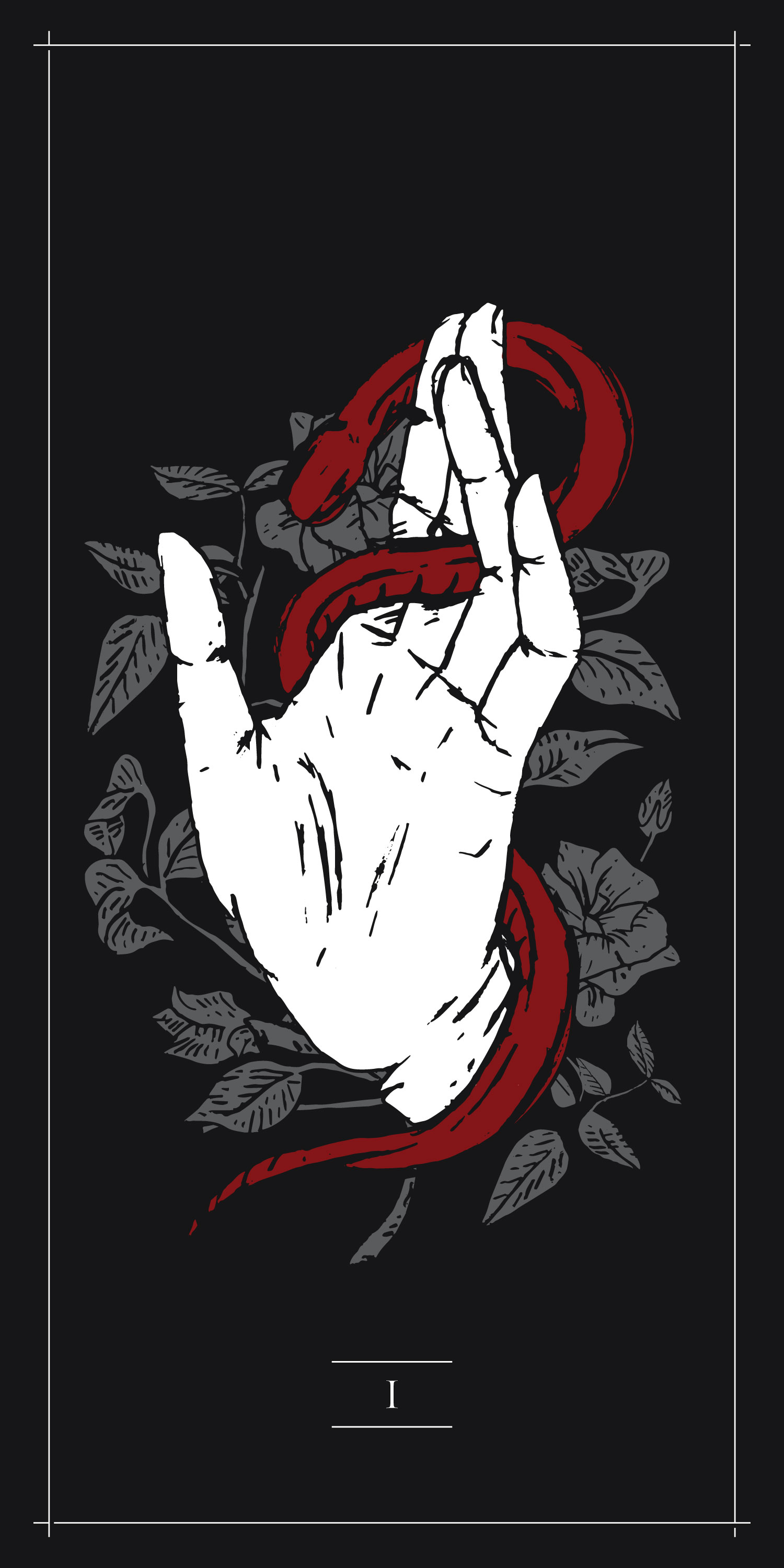
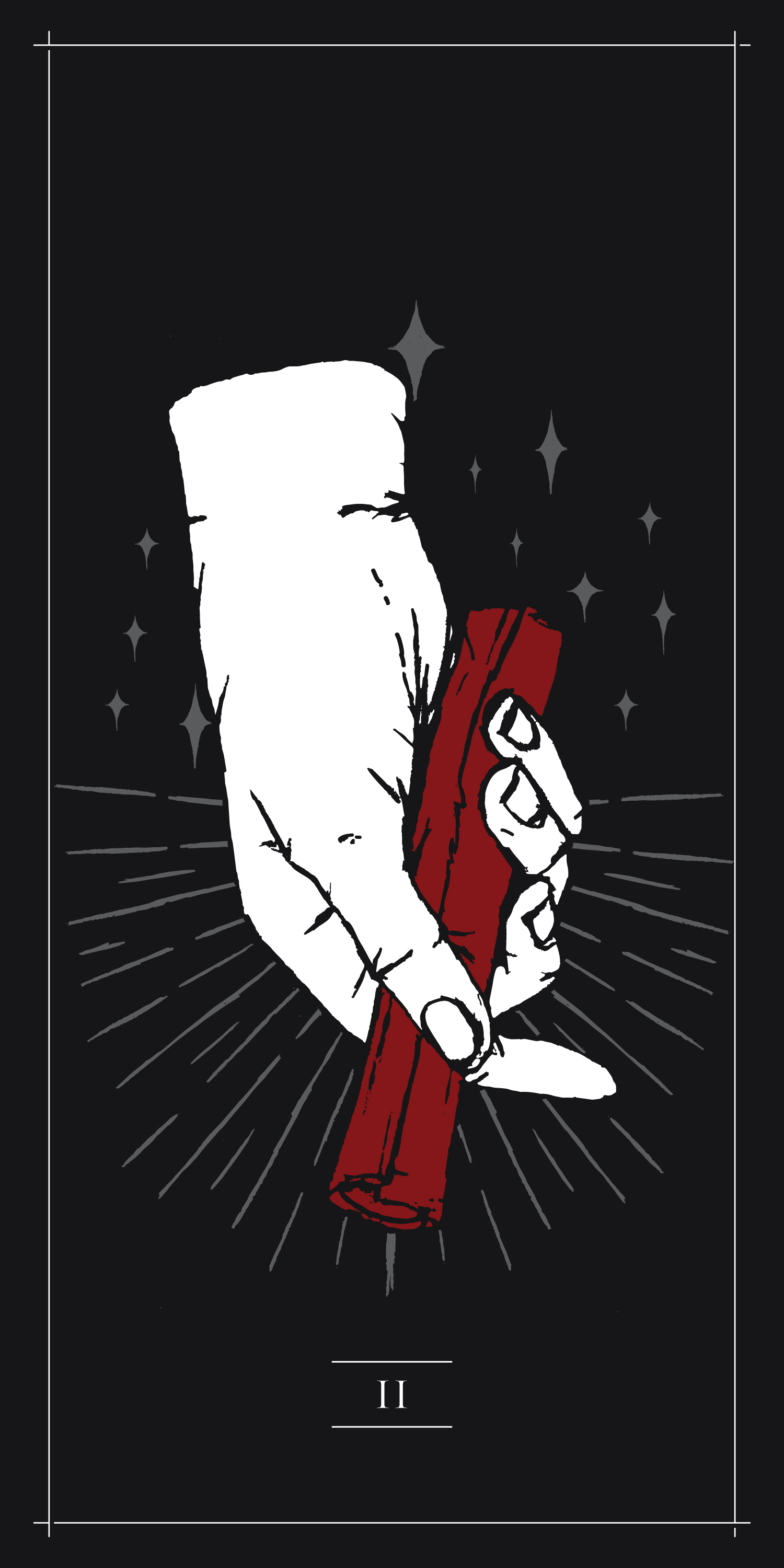
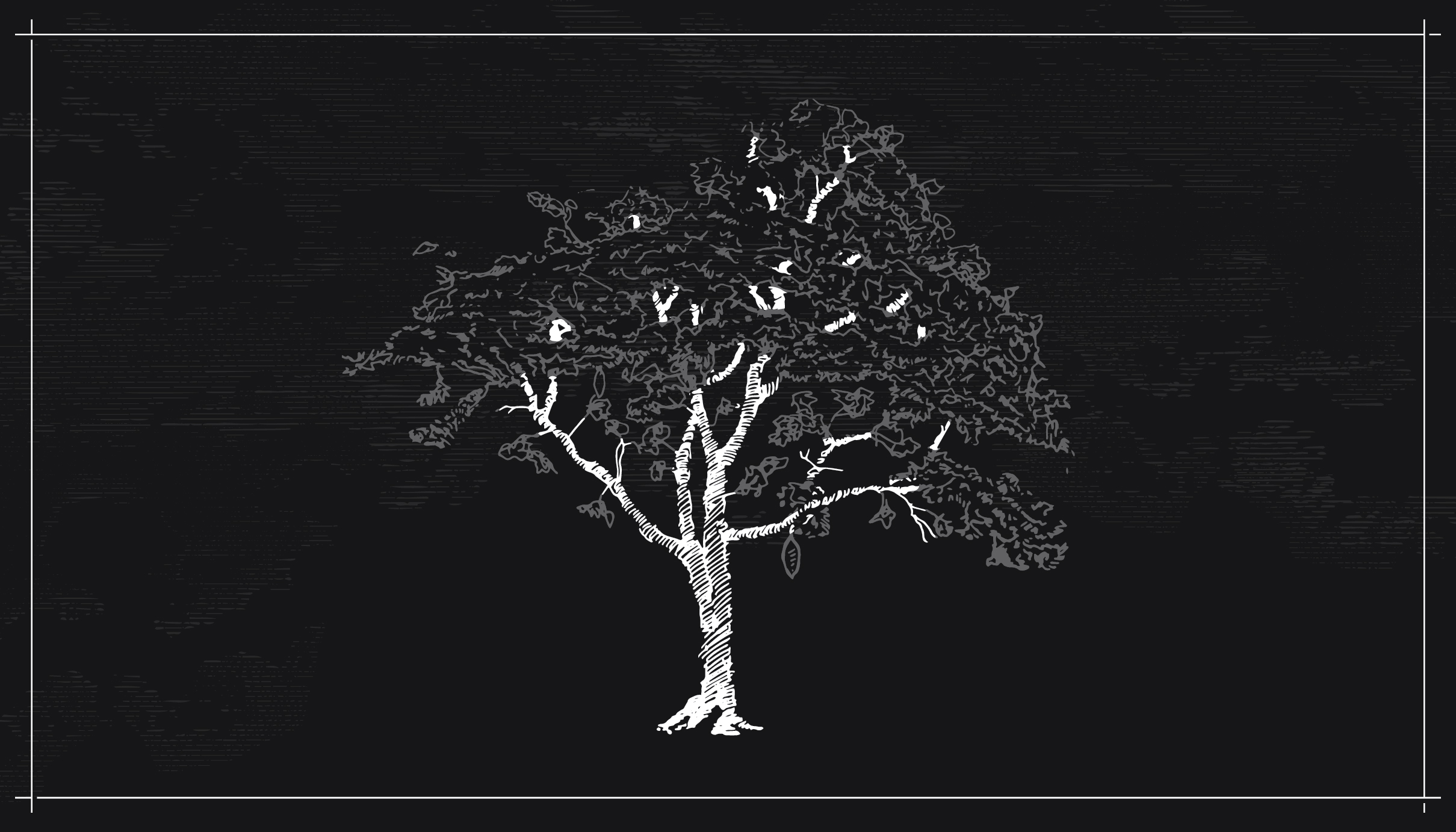
The artwork for this series was illustrated by hand by Christian Robinson, an artist from Oklahoma City. Our Genesis series is aimed at discussing God’s foundational worldview for His people and their purpose in His world. Christian’s artwork, in three pieces, illustrates the series’ two main movements (Parts I and II) and its narrative bookends (Part III).
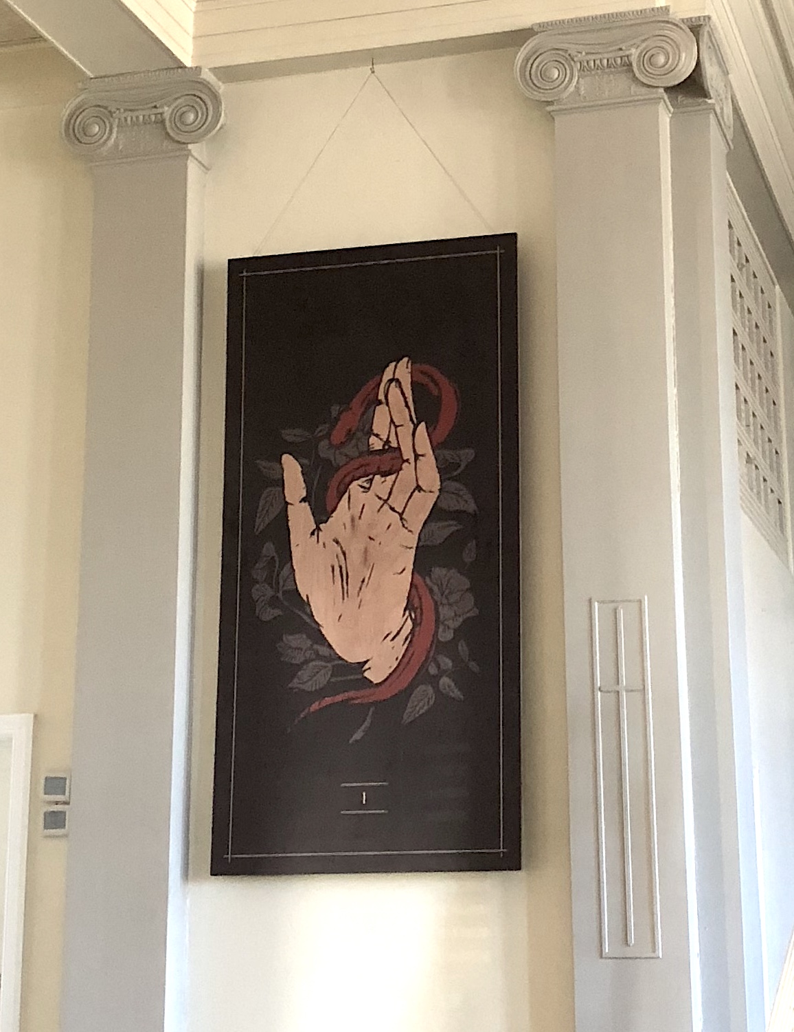
Part I depicts God’s creation of the world (the foliage) and its subsequent de-creation through mankind (the hand) as a result of satanic temptation (the snake) and human rebellion.

Part II depicts God’s creation of a people (the 12 stars for 12 tribes of Israel) as God (the hand) comes to Abraham and makes a covenant (the scroll) with him and his descendants.

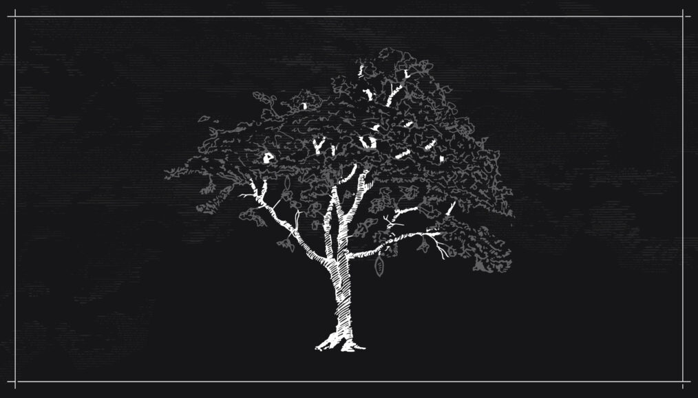
Part III depicts the Tree of Life. The Tree of Life appears both in the Garden of Eden in the book of Genesis and again in the New Jerusalem in the book of Revelation. We are reminded that, although at the Fall we were shut out of the Garden and barred from living forever, our ultimate destination as a result of Jesus’ redeeming work is life in a re-created world, in the Holy City, where the Tree of Life is now open to us.

Lastly, each of the three pieces were printed directly on to large birch wood panels. In place of any “white” in the above artwork, the natural woodgrain shows through; a nod to creation itself.

Advent 2017 Artwork

Person

Jeremy Grant is an emerging artist and award-winning graphic designer. He was born in California in 1985. He studied Graphic Design and Illustration at John Brown University. Grant has exhibited his collage and assemblage work regularly across Colorado since 2008. An active member of local arts communities, Jeremy has been invited to participate in numerous group shows, donated art to charity, and been awarded a PPAC micro-grant. His work explores themes of destruction and creation, death and resurrection, and chaos and familiarity. Jeremy Grant currently lives and works in Denver, Colorado.

Piece

Isaiah 40Mark 1
Often during Advent, I contemplate the calling of John the Baptist—“to prepare the way of the LORD,” and to “make straight in the desert a highway for our God.” This calling feels just as relevant for us as it was for him. The people of God had been waiting for Messiah, their Savior King, for hundreds of years. Generations upon generations had lived and died and not seen the promise fulfilled. John’s prophetic calling took him on a difficult path through the desert to preach a baptism of repentance for the forgiveness of sins. John was asked to clear the path for the coming Messiah, Jesus. The scriptures that refer to this calling paint a picture where “every valley shall be lifted up, and every mountain and hill be made low.” The subject of the piece is a landscape that visualizes the work of John the Baptist—the transition from rough, mountainous terrain to open plains is making smooth the way of the LORD. The mountains are cut from pieces that I felt had a sense of static and a feeling of brokenness. We still live in a broken reality. Some brokenness is obvious and agonizing, and other times brokenness is characterized by the monotony of existence—the lack of joy, color, and celebration. The extra-long proportion of the piece is meant to convey the passage of time, a sense of waiting and of a long journey still ahead. The dark to light transition hints at the coming sunrise, our current reality is dim, but the bright light of the coming messiah is a dawn on the horizon. Click on an image below to enlarge.
The complete, final piece:
The sequential pieces, with Advent 2017 sermon series titles:

Process

Hand-cut paper collage inspired by the themes of the season of Advent. At first, I sought to express brokenness through fragmented pieces—tiny windows into pain. Ultimately, this felt a little one-dimensional and I left it in favor of the landscape idea which had a more rich meaning (see final artwork above). In another early concept, I envisioned cracks and a shattered pattern getting less and less cracked -the color getting brighter and brighter as the collage progressed. U;timately, I felt like it was—again—less robust of an idea, and cracks don’t really “heal themselves.” It’s difficult to express that idea, even though I liked the graphic potential of it. Lastly, an image of the final collage in-process, before I added the pink squares. The squares sort of came to symbolize markers in the passage of time, little ebeneezers if you will.
Holy Week 2017 Artwork

Our artwork for Holy Week (Palm Sunday, Good Friday, and Easter Sunday) were done by Bruce Butler. Bruce is usually seen at Park Church either co-leading his Gospel Community or playing electric guitar as we worship through singing. However, by trade he’s a graphic designer and he agreed to work with us to illustrate these three critical days in our Christian Calendar year. Read the following, written by Bruce, to learn more about the artist and his art.

Who I am

I am a graphic designer and musician from the East Coast. In 2012, I moved to Denver from Buffalo, New York to be closer to family and began designing for WorldVenture, a missions organization in Littleton, CO. I’m currently designing for Olsson Associates, a civil engineering consulting firm in Golden. I co-lead a Gospel Community near Sloans Lake and, in my free time, I enjoy playing music, cooking with friends, and spending time with my nieces and nephew. You can see more of my work by following me on Instagram at @madebybruce or visit madebybruce.com.

Piece

Biblically, the word “hand” represents an ownership, power, or control yielded by its owner. In each of the pieces, I used this “hand” imagery to illustrate humanity’s role in Holy Week, as well as the underlying tone of each day. The trapezoid is meant to represent a triangle with one side missing, highlighting one of the most overwhelming aspects of Easter: that Jesus not only stepped out of the infinite to become man, but that on the cross He chose to break eternal communion with the Trinity to take on the wrath of God that we deserved. For Palm Sunday, Jesus was ushered in to shouts of “Hosanna! Blessed is the one who comes in the name of the Lord!” (Mark 11:9) with the waving of palm branches. But this celebration was the beginning of a storm brewing. By the end of this week, these same people were calling for His blood. The hand waving the branch represents the world—and even the Church—often worshipping who we want God to be, and not whom He has revealed Himself to be. For Good Friday, we are reminded that our redemption came at a great cost. The storm that had started earlier that week erupted on Friday. After having been seized, beaten, and given a rigged trial the previous night, Jesus willingly continued his walk to the cross. Without getting into the gory details, flogging was a barbaric act that most victims didn’t survive. Though it was not the hands of the religious leaders holding the whips, when the crowd chose to release Barabbas and crucify Christ, their ownership in Christ’s death was stamped over the whole event. And lastly and most importantly, with Easter we celebrate that He’s alive; that despite our misplaced worship and rebellion, He used His ownership, power, and control to run after us and pay the debt we owe. The storm has been broken up by the light. In seeing Jesus’ open, nail-scarred hand we are reminded that we play no part in earning our place before God, but it is offered as a gift. Click on an image below to enlarge.

Process

When asked to create this piece, it was a bit daunting knowing this is the event that is the culmination of our beliefs as well as something millions try to artistically reinvent yearly. The idea of it being based on hands and ownership came before choosing which style I would attempt. Because of the “grittiness” of Easter week, I decided to lean more towards a textured, illustrated style. Though I usually favor more digital art, I was inspired by artists like Dave Quiggle and Sam Larson to broaden my technique and include vivid colors, textures, outlined strokes, and hand drawn techniques like stippling. I started in Adobe Illustrator, making thin templates for the branch, hands, and whip, and printed them. I then added the detail in pen and also did an entire page of just clouds and lightning. I imported these into Photoshop by taking a picture with my phone and erasing the background white layer.

The rest was done in photoshop using several textures.

Click on an image below to enlarge.

Advent 2016 Artwork

About the Artwork

You may have noticed the artwork for The Coming of the King: Advent & Christmas—the two banners on the sides of the stage and the design on your bulletin and on the screen during the service. If you were here last year, you may have already picked up on the fact that it’s all very similar to the artwork for God With Us, our Advent 2015 series. You’re correct.

Last year we worked with Jeremy Grant, an incredible designer and collage artist, to create that work. This year, we’ve taken Jeremy’s art from last year and, with his permission, “remixed” it for The Coming of the King. Why did we choose to do this? Here’s what Jeremy writes about the original piece:

Purple and dark blue colors symbolize waiting and longing, and are the traditional colors of Advent. These darker areas (collaged from images of evening, twilight, deserts and water) show the brokenness and chaos of our world as they cut back and forth sharply.

Lighter colors (collaged from images of clouds and morning light) symbolize Jesus, the “light of the world,” cutting through darkness and chaos to bring light and peace. Little stabs of pink color represent joy.

There are two banners, representing Jesus’ comings to earth. Jesus, the messiah, has already come down to earth (as a child in Bethlehem) fulfilling the longing of the prophets and people of God from centuries past. And Jesus, the master of the cosmos, has promised he will return to earth again. So we look back, and remember what he has done. And we look forward with eager anticipation to what he will do next.

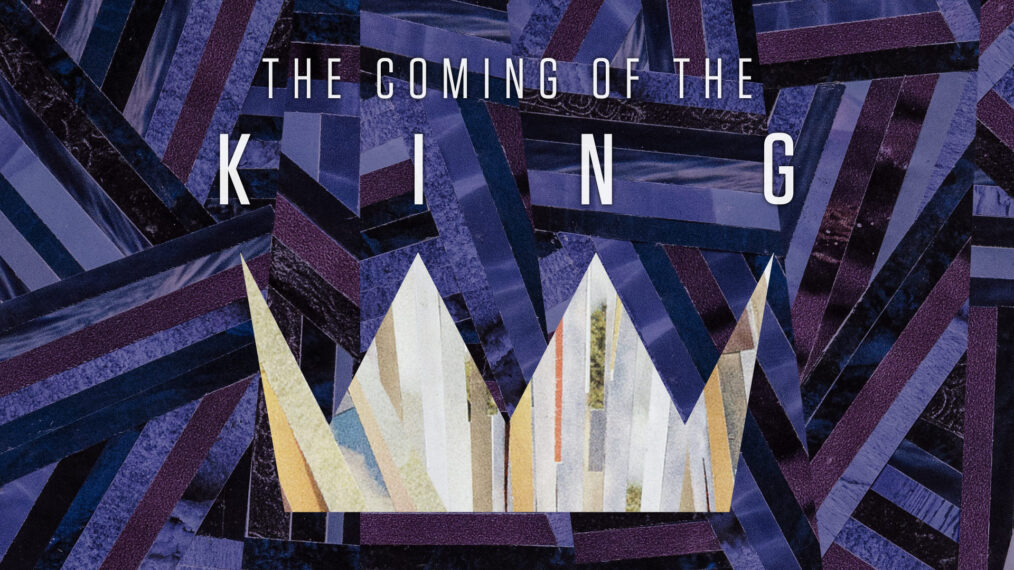
Whereas last year the lighter colors were in the shape of a sunburst, symbolizing the great shock and “thrill of hope” that is Christ actually among—God With Us—this year the lighter colors make a crown. Not too much of a stretch for a series entitled The Coming of the King, right? Why use something so obvious?

The lordship of Jesus Christ, although “obvious” to His followers, is certainly not obvious enough—not even to His followers! Do we understand that, in all of our darkness, in the valley of the shadow of death, in sin and error pining, a King has come and rescued us? Do we prepare Him room in our hearts to be the actual King? His crown is not symbolic, and His authority is over a real kingdom whose increase will never end.

Lastly, at the point of each crown is dot. Three of the four dots are purple and one is pink, symbolizing the advent candles that traditionally symbolize the four weeks of Advent leading up to Christmas Eve. In an Advent wreath, these four candles surround a larger, white “Christ candle” to be lit on Christmas Eve. In our illustration, the white crown stands in for the Christ candle, supporting those four other points.

About the Artist

Jeremy Grant is an award-winning artist and graphic designer. His collages and found-object assemblages have been exhibited in solo and juried shows across Colorado and Arkansas. Jeremy is married to an author, has two beautiful babies and loves Jesus, bourbon and robots. You can check out more of his work at jeremygrantcreative.com.