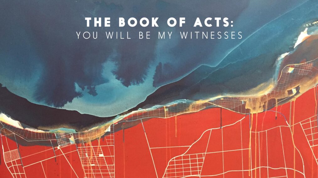
The Book of Acts: Artwork
Vision and Symbolism • JD Raab
The gospel is moving throughout the earth. It is confronting actual men and women with the truth in actual cities where it’s causing actual change. Whereas I’m tempted to think of it as a soft thing—a whisper between friends or some Precious Moments angel in a glass-doored dining room hutch—the gospel is nonetheless a vast, moving force, changing even the most fundamental things about our world as you read this.
The gospel demands a decision: ultimately you’ll either violently oppose Jesus’ rule or to submit to it entirely with pure joy. In the book of Acts, no one is safe from getting caught up in this tension; Caesar is not safe from getting caught up in this tension! That exact gospel tension is here now in our own city, still doing its good work—Jesus demanding with absurd love for my very soul that I “Choose this day whom I will serve.”
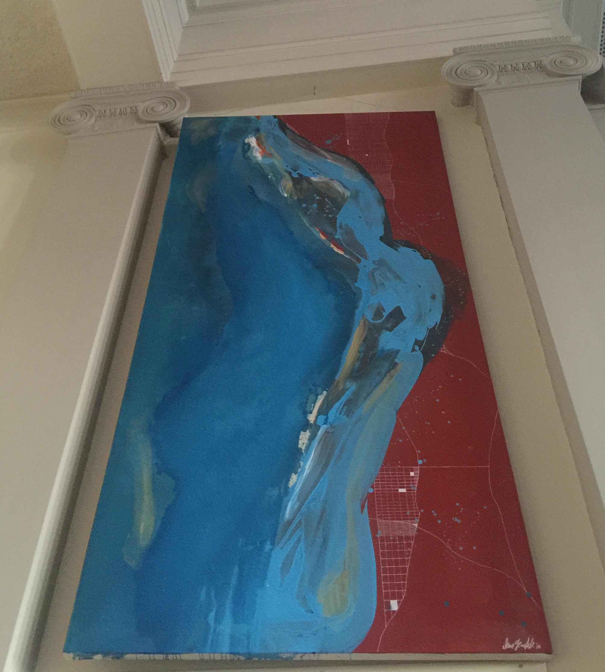
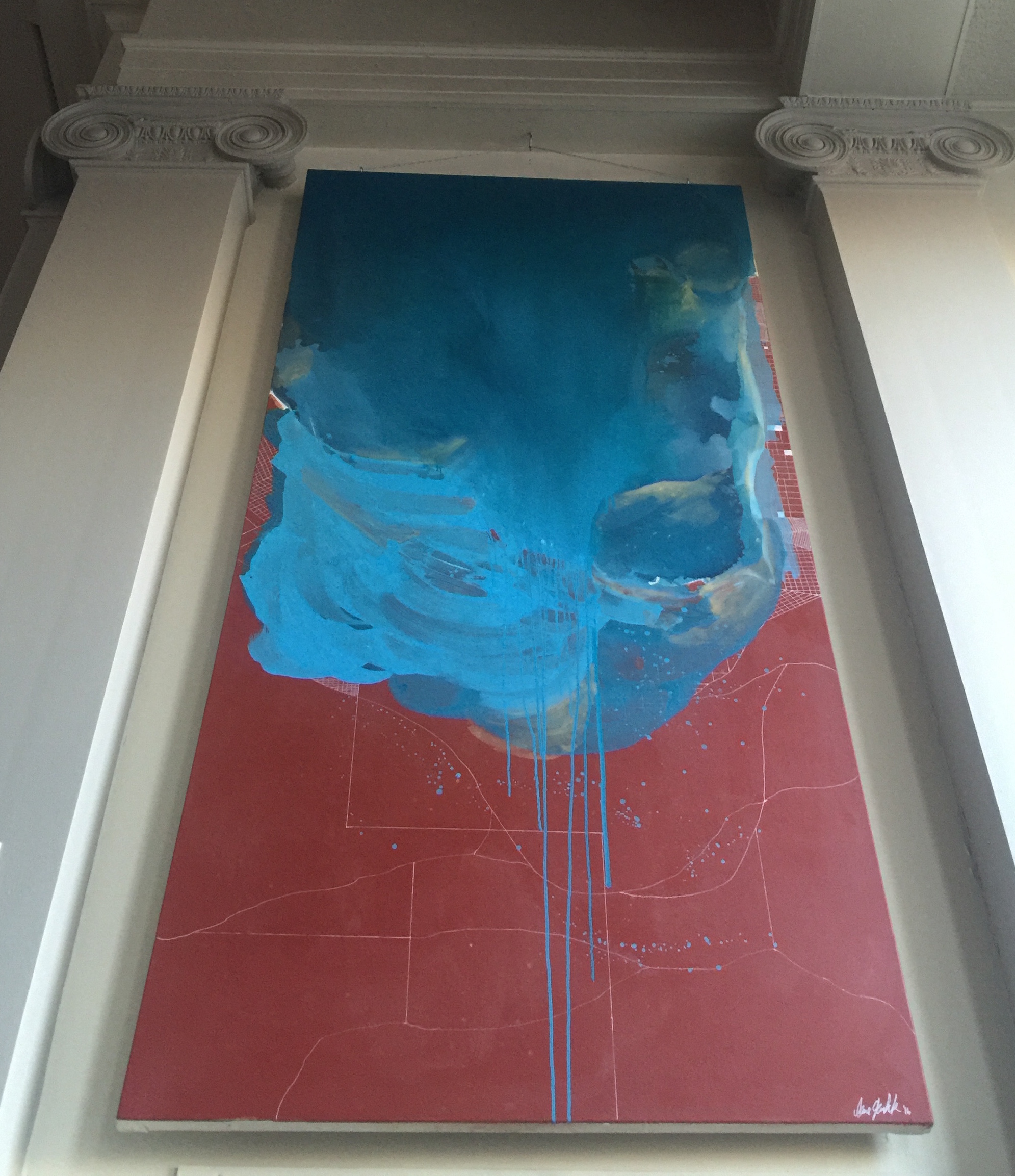
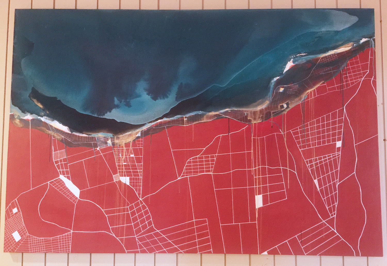
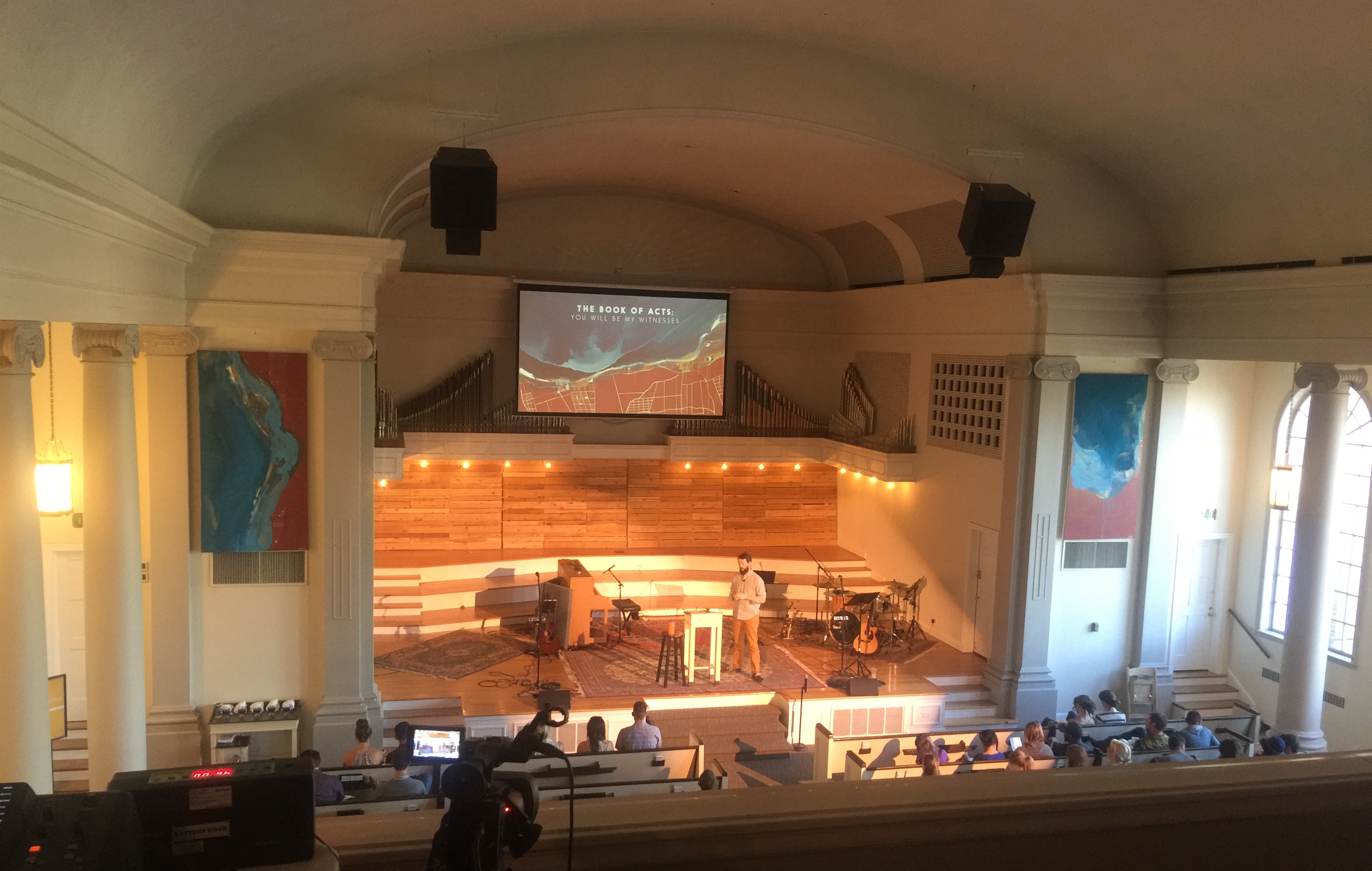
Working with Lane on this triptych was a neat experience, because I had so many things (too many things) that I wanted to communicate, yet was at the mercy of an incredible abstract painter, with whom you “feel” arguments way before you “read” or see them. We brainstormed about an organic, “water”-like mass overtaking a more structured, rigid space. There needed to be a tension where the two “halves” of each painting met. A thick, golden, messy tension. I cannot tell you just how skillfully and perfectly she made this vision happen!
So it goes without saying that the blue part represents the gospel, advancing decisively and interminably on the land/our cities/the world (the red part). The overlaps between those two bodies represent the heavy, potentially wonderful decision that all of life faces—to submit with joy or violently resist and be swallowed up.
Creative Process • Lane Geurkink
After walking through the concept and overarching message of Acts with JD my first initial idea was to make something BIG. That not only the composition would speak to the concept, but that the size would be so large that it would be hard to miss and captivating.
I chose the burnt red color for the background of the “city” lines because I wanted a color that had a high contrast value, that wasn’t too pretty and represented a kind of beautiful brokenness. The “city” does not represent a specific city but a hypothetical one. This was drawn with white chalk paint pens. The blue is meant to represent the flooding of the gospel over the city, as JD said before. I used several washes of shades of blue, white, and gold to make this section. The gold is an added representation of the gospel too. My hope is that with the organic shapes of the blue with the contrast of the geometric lines of the city, it will speak boldly to the tension of the world without the Gospel and our need for it. I was so happy to work with JD on this and have his help to conceptually create something for Park, as well as his exceptional design!
